“How old were you when you got your first phone, daddy?”, asked my 8 year old daughter. She looked shocked when I told her I was 28 and it was 1997. She was just as surprised when I told her that I sent my first email when I was 26 and used a browser for the first time that same year. She was even more shocked that the first iPad didn’t exist until 2010. In fact, she was so shocked that she looked it up on Wikipedia on her iPad just to confirm I wasn’t kidding.
I told her about telex, fax machines, computers that filled a room, office circular memos that went from in-tray to in-tray, and how we sent letters that took several days to get to their destination. She told me it all sounded very weird. Looking back, I might be inclined to agree with her. Compared to today’s marketing driven, connected world, it does seem a little quaint.
A long time ago…
…in what seems like a galaxy far, far away, an enthusiastic, fresh faced young college graduate (that would be me) started his first job in PC support. It was 1991. My first task in the professional world of Information Technology was to construct a brand new IBM PC with its super-fast 286 processor, a 20Mb (yes, megabytes) hard drive and an 11 inch color monitor.
While this might not sound like a particularly magnificent bit of computing hardware, at the time it was pretty close to cutting edge, particularly as it came with a 1Mb memory card. Most computer users at the company were still using the IBM mainframe and IBM 3270 dumb terminals. We affectionately referred to them as Russian TVs. Huge boxes with tiny little green and black screens that seemed to weigh a ton. I once saw one magically “float” out of my colleague’s arms as we transported it from one floor to another in the elevator. The power cable was stuck in the door and as we descended, the terminal simply stayed where it was until the cable broke. It seemed to weigh a lot more when it was falling.
Fast forward 20 or so years and I’m looking at the right hand of two 23 inch full HD, 10 point touch screens, weighing barely a few pounds, 50,000 times more disk space and 12,000 times more memory. It’s a good machine by today’s standards, although nothing spectacular. What is remarkable though, is that in about three years’ time I’ll replace it with another even quicker one.
In the last 20 or so years we have seen a change from an 80 x 24 16 color screen accessing one very big computer, to 1920 x 1080 HD screen with 32 million colors connected to billions of devices via the internet. Technology has changed incredibly since my career began, and continues to do so at an increasing and almost alarming rate.
Same but different
My first programming job was to write a month end report, and from there the complexity grew to encompass data enquiry programs, maintenance programs, executive information systems and a great variety of other data processing applications. But for all the changes in technology, developers are still writing much the same reports and applications as I did then. In fact, I can’t think of a single job I did then that isn’t still very much part of modern day corporate IT.
There may have been different solutions governed by the capabilities of contemporaneous technology, but the core functionality of enterprise applications hasn’t really changed. Regardless of appearance and delivery mechanisms, corporate software has always been driven by a need to let a variety of users with differing requirements access data quickly and efficiently, so that they can go about their jobs and lives armed with as much information as possible.
What the internet did
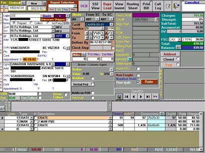
Green screen applications were pretty predictable in terms of behaviour and appearance, and desktop client server apps were really only little better, although the designer of the application shown in figure 1, might beg to differ. A list on a green screen looks much like a list on the desktop and input fields look rather similar to edit boxes. We could even argue that function keys and toolbar buttons aren’t so very different. However, the rise of the internet, smart phones, tablets and the importance of marketing has changed the role of the programmer for ever.
Back in the day, applications were delivered on a green screen. Today I might use a desktop Windows application running client server, or perhaps run in a browser. I might build an app for a phone or tablet.
Back in the day, my users were employees and I knew most of them. Today, we’re expected to build for customers, prospects, suppliers and other parties as well, thousands of people with varying degrees of computer literacy that we never met or will meet.
Back in the day, I had a screen with columns of data in lists, fields, some function keys, 16 colors and one font. Today, I still have data in lists, although increasingly the formatting isn’t columnar. I still have fields and function keys, but I also have a mouse, touch, drag and drop, every colour of the rainbow, a wide variety of fonts, and if that’s not enough, I can play with the opacity of anything and make it partially or completely transparent if I want.
The core of an application hasn’t changed. Server side processing is really mostly as it as has ever been, but the UI is now utterly different. Web pages and mobile apps look more like magazine covers than software and many of the traditional rules for organizing a UI have been thrown out.
The art of application design
The success of systems is no longer simply based on something as trivial as whether they actually work. We’re now concerned with the user experience and how engaging the UI is. The humble user of yesteryear has been replaced by a tech savvy smartphone owner who expects ease of use, excellent functionality, and a pleasing aesthetic. And of course, what applies to a browser application is pertinent to a desktop too.
Larger companies often employ specialist staff to ensure the best possible experience, something that is becoming increasingly necessary for customer facing websites. And rightly so too! A website is often the first experience a customer has with a company. A failure to engage from the outset often results in a failure to engage at all, and if that’s the case for external customers, it’s reasonable to think that it would apply to internal users as well.
A few guidelines
Regardless of the platform used to deliver an application, the rules for UI design are really much the same.
- You only get one chance to make a first impression
Your start screen needs to encourage the user to stay, so make the start point of your application as simple and familiar as possible, and make progression to the next level of detail obvious.
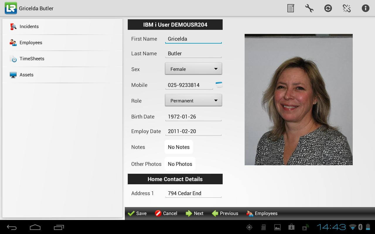
For example, the application in Figure 2 has a list of application areas on the left and details on the right, a very simple but highly effective application model. - Keep your palette small
Use only one or two different fonts throughout and keep the size/bold/italic/underline variations to a minimum. If you’re choosing your own color scheme (for mouse over, selection, focus, etcetera), a good tip is to pick a base color and then use lighter and darker variations. This is easily achieved by adding, or taking away, an equal percentage from the red, green and blue components each to get a lighter or darker shade.
Unlike Figure 1, Figure 2 below uses a simple palette; a single font with one or two size variations and four or five complementary colors. - Be consistent
Use the same simple language and techniques throughout the application. Users don’t want to have to interpret abbreviations or learn different ways of achieving the same results on different screens. - Get your priorities right
The majority of most typical application use is simply looking at data rather than editing it. Take the time to position the commonly required data first and use styles to make it stand out further if required. - Beware the skeuomorph
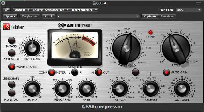
Tempting as it may be to make a screen control look like its physical equivalent, the benefits are few. This is particularly relevant when dealing with line of business applications where precise data entry is hard to accurately emulate. - Keep it simple
There is little more frustrating than software that thinks it knows best when it doesn’t. Keep commands and actions simple and easily understood.
Applications developed with LANSA
LANSA’s repository and integrated development environment strongly promote code reuse and help ensure that your applications look and behave consistently, whether they’re going to run in the browser, desktop, or mobile.
LANSA’s IDE WYSIWYG designer, integrated layouts, centralized styles and high level language focussed on application logic rather than UI, means that writing applications with LANSA really is a case of ‘less is so very much more’.


